
The Psychology of Color in Branding: Why Your Palette Matters
- Jason Calderon
- May 28, 2025
- 2 min read

Color is more than an aesthetic choice—it's a strategic tool. In the world of branding, color is one of the first signals your audience processes, often subconsciously. It informs perception, evokes emotion, and can either reinforce or undermine your brand’s message.
At JC Designs, we believe that effective design isn't just beautiful—it’s behavioral. Understanding how color influences decision-making and perception can make the difference between a brand that’s forgettable and a brand that’s iconic.
Why Color Psychology Matters
Human beings are hardwired to respond to color. Neuroscientific research has consistently shown that color affects mood, attention, and even physiological responses like heart rate. When applied to branding, this means that your color palette becomes a silent but powerful ambassador of your brand's overall identity.
Consider how a tech startup using blue evokes trust and stability, while a boutique cosmetics brand using soft blush tones evokes luxury and intimacy. These aren't just visual choices—they're psychological triggers.
The Symbolism Behind Common Colors
While cultural nuances must be taken into account, certain color associations remain consistent across various industries:
Red: Passion, urgency, action. Often used in food and entertainment.
Blue: Trust, intelligence, calm. Common in finance, tech, and healthcare.
Yellow: Optimism, creativity, warmth. Effective in retail and casual dining.
Green: Health, growth, sustainability. Favored by eco-conscious and wellness brands.
Purple: Royalty, creativity, spirituality. Used by beauty, education, and innovation-driven companies.
Orange: Energy, friendliness, enthusiasm. A go-to for youth brands and startups.
Each color doesn't just convey meaning—it anchors expectation. The right combination can elicit trust, build recognition, and shape emotional resonance.
The Power of Contrast and Consistency
Color isn’t just about standalone choices; it’s about interplay. High contrast palettes improve legibility and engagement, especially in digital environments. Consistency in palette across platforms fosters brand cohesion and builds familiarity—a key predictor of customer loyalty.
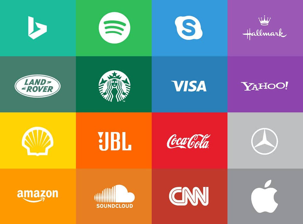
Think of brands like Coca-Cola, YouTube., or Spotify. Their color choices are instantly recognizable, not only because they are distinctive, but because they’re consistent.
Strategic Application in Brand Design
When we build or refresh a brand at JC Designs, color is never an afterthought—it’s foundational. We consider:
Target Audience Psychology: Who are they? What emotions do we want them to feel?
Industry Context: What are competitors doing? In which areas should we differentiate and in which areas should we align?
Digital and Print Performance: Will the palette translate across mediums?
Scalability and Simplicity: Can this color system grow with the brand?
A well-chosen palette should serve your logo, website, packaging, signage, and social media equally well, while leaving room for seasonal or promotional flexibility.
Final Thoughts: Color as Strategy
Branding is the sum of every interaction a customer has with your business—and color is often the first impression. In a marketplace saturated with content and competition, your palette isn’t just visual. It’s tactical.
If you're ready to take your branding beyond surface-level design and build a color system rooted in psychology, strategy, and scalability—we're ready to help. Reach out to us here.


Comments